YOUR GUIDETO AN AI

Making ambitious digital ideas achievable


for organisations doing serious good in the world. For people, planet, and the missions that matter.
Trusted by the Changemakers
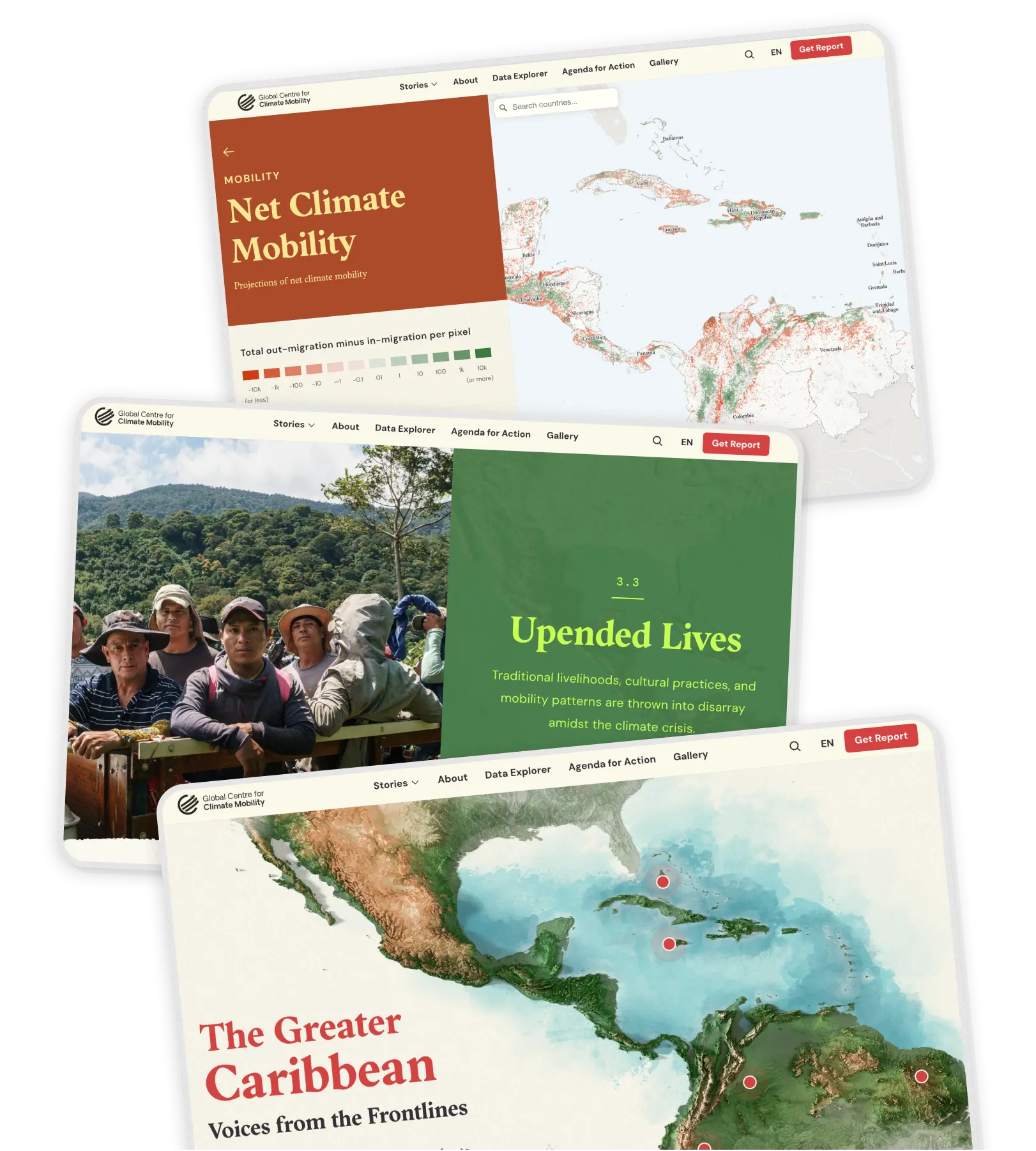
We build technology that matters for some of the world's most impactful organisations.
From disaster response and climate action to mental health and global connectivity, these are the missions we're proud to power with our tech.

Client listing: Global Centre for Climate Mobility, IFRC, Glastonbury Festival, NHS, UNHCR, Vodafone, Omaze


AI FOR GOOD
Adoption at a tipping point
2025 Report

Building With
AI
AI success isn't about perfect planning, it's about practical, hands-on learning. Pilot quickly learn from real results, and scale up what works, instead of trying to map out every detail beforehand
 AI success isn't about perfect planning, it's about practical, hands-on learning. Pilot quickly
 learn from real results, and scale up what works, instead of trying to map out every detail beforehand
That's why we built...

Fast Play
Ideas to prototype in a week

Our rapid AI prototyping sprint where we turn bold ideas into working proof-of-concepts in just days, not months.
Changing Millions
Of Lives For the Better!
We believe tech should do more than just work. It should matter!

Since day one, we've built digital products that show up when it counts.
