Why develop a dashboard?
The idea was born from a criminally underused piece of kit we have here at CUBE HQ. No, not the ping-pong table, the office’s 72″ TV.
Don’t get me wrong. We use the big TV for a lot of things, such as our Happy Half Hour and Lunchtime Learning Club knowledge sharing sessions. But during the working day when we’re not gathered around our bean-bags and potted-plants, the TV goes mostly unused and I was keen to put it to better use.
Having worked recently on our hazards platform for the American Red Cross, my original idea was to show off some of the data we gather for our mobile app development projects, such as where disasters are happening in the world and how many push notifications were sent that week.
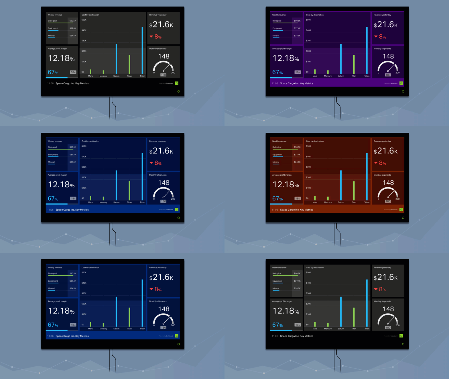
Here’s a different example of how we’ve visualised our data in the past:
I was also aware of some common problems we had around the office such as finding a free meeting room and knowing what time it was in Seattle.
Personal projects can get easily derailed, which is why it was great that a project manager was assigned to help, and together I and Luke formed our objectives.
The project objectives:
Give more visibility of exceptional events (traffic, downtime etc.) to project stakeholders.
Provide a status check of what’s going on around the office at a glance.
Help share the impact we’re having with employees and new visitors to the office.
Tackle common office problems.
Be easy for any developer to keep updated and extend.
Getting started: data visualisation.
My first lesson, Hazards data is complex.
Thankfully we use Chartio which does the hard work of processing our data to allow our clients to get reports on their data. They can use it to generate graphs and exports for our stats on the hazards platform. I had wanted to use Chartio’s graphs to embed into my dashboard; the only problem was you need a pro account to embed graphs. I started to look at building my own graphs from this data when…
Experience told me I had my head in the sand.
I could have used up the bulk of my week getting this data out, building it into a fancy chart or graph and had nothing to display it in! It was important that I had something to show at the end of my week, so I switched my focus for day 2 and worked on putting a dashboard framework in place that we could feed data into once we had it available.
(I took a lot of inspiration from Geckoboard and Cyfe, to name a couple).

Open-source software? Step in Spatie.
Spatie is one of my favourite companies around.
Not only are they are they infamous for writing open source software, but I was even lucky enough to meet some of the Spatie team when I was a speaker at the PHPUK conference last year.
Having not wanted to reinvent the wheel (I felt that a dashboard framework was a solved problem) it was no surprise that it was their blog I landed on when searching for an open source dashboard. (And yes, they will be getting another Postcard!).
(Check out their GitHub for more great open source software!).
Laravel and Vue.js.
Even better, their dashboard was written in our frontend and backend frameworks of choice.
We use Laravel because its a well-known framework among backend developers, meaning there’s a bigger community (including lots of open source libraries), great documentation and a tonne of experience of using the framework.
Vue.js is our first choice because it lets our frontend developers build components for a project without being to be locked into building the whole project on the framework, meaning we can use the right tools for the right job.
The fact that the Spatie dashboard used these meant that all the developers at CUBE would be able to build their own components for it, which was one of my key objectives.
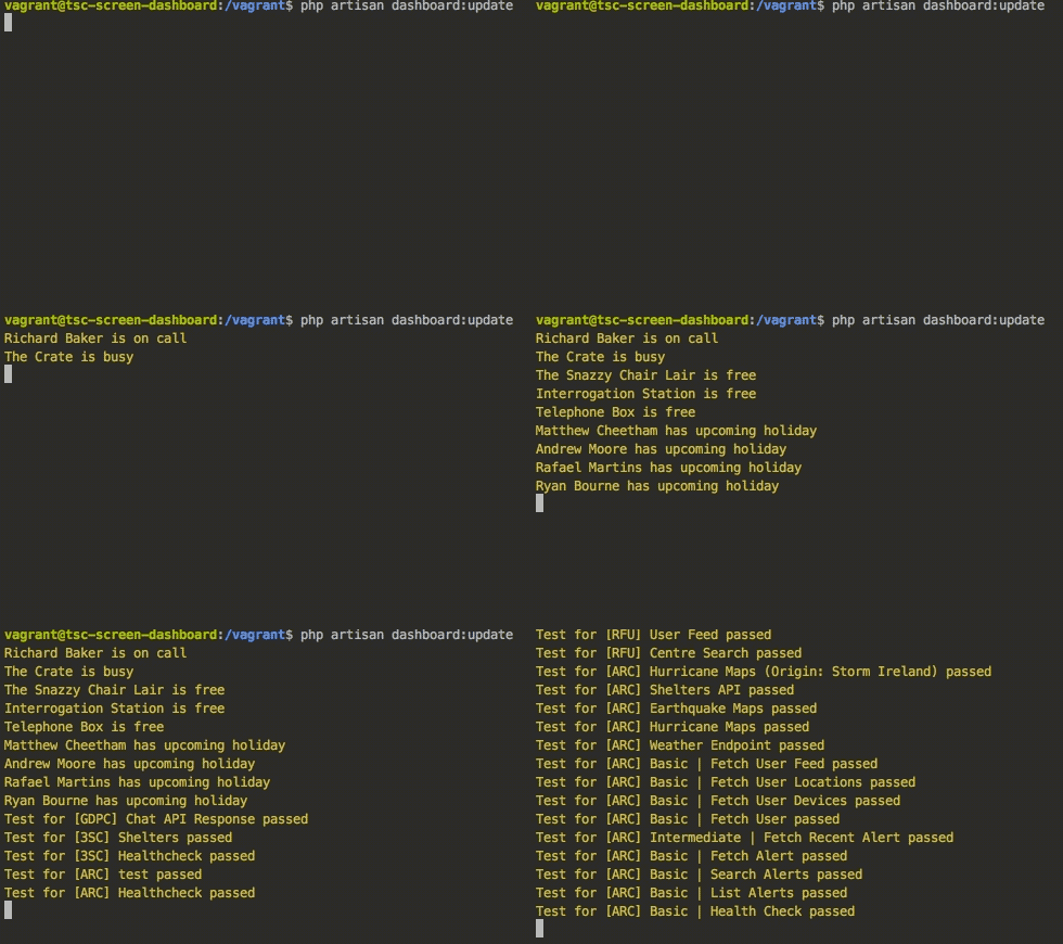
 Laravel’s command line tools make it easy to test if integrations are working.
How it works: Let's talk API's.
The dashboard uses Pusher, a simple hosted API which let me quickly and easily integrate real-time functionality to the web, mobile and other connected devices.
It is publish-subscribe event-based service, which allows the dashboard to be able to display updates to data as soon as it receives it (instead of requiring a browser refresh), and that data can be ‘pushed’ to it from any external service connected to Pusher.
Spatie’s dashboard comes out of the box with a few great widgets already, such as a google calendar integration. Other services I added were Pagerduty (which we use for on-call support) and Runscope (which checks the health of our systems).
An automated scheduler runs on a hosted server on the web, polling these APIs at regular intervals to get the latest data, and then publishes that data to pusher’s channel (I should really leave diagrams to the creative team!).
)
The dashboard also has a Twitter Streaming API component, which works a little differently as the streaming API pushes data to us when it’s available, rather than us having to request it.
(It’s often referred to as a firehose, which I like as a metaphor as it fires a lot of data at us).
Dashboard widgets for CUBE.
The google calendar schedule widget, weather widget, and twitter widget are great but don’t provide that much value to the dashboard.
As per my objectives I wanted to do a lot more with this dashboard and now I had one running, I was able to spend my time focusing on building widgets that add that value to the office rather than spend time building the dashboard itself.
As mentioned before, our hazards data is complex, so I focused on easier widgets to create to start with. Here’s what I managed to build by the end of the week.
)
The future of our dashboard?
First I want to look at the problems I have left to solve.
The main issue is that I am casting the dashboard from my mac to the big TV. Moving forward I want to use a Raspberry PI that we could use to stream the dashboard without me needing to be there casting.
I also want to start displaying more complex data from some of our apps and platforms (this may take a little longer than a week!). To really show off the impact we’re having as an agency and so people can see all of the progress we’re making.
Published on 2 February 2018, last updated on 15 March 2023
)
)
