)
)
Let's discuss app wireframing.
In an ideal world...
Mobile app designers would read the brief, hunker down to their craft, and emerge with a set of beautiful product designs that the client and technical teams would give an emphatic thumbs up to (maybe a whoop or a tear of joy) before the project seamlessly slips into production.
However, design can get complicated.
It tends to be that only once a product concept is made visible, do people start to really envision a final product. And as such, it tends to bust open a ‘pandora’s box‘ of different assumptions.
Getting cogs turning on how ‘x’ would work, and whether ‘y’ is as important as ‘z’.
At this stage in the process...
A series of design iterations going back-and-forth typically ensues, with agreements on core concepts of the product eventually being achieved, but only through the time-expensive process of visual design.
In the digital products industry?
We try to flush out these disparities of assumption early on through wireframing. Wireframes are a pared-back visual language of simple shapes and arrows that detail as much of the designer’s thinking as quickly as possible.
The process of making them is quick and messy; they can be made, broken and reassembled at a fraction of the time of the final high-fidelity designs.
But conceptually...
They are budget lifesavers that help get the foundational work signed-off as soon as possible. So that the designer can then simply apply crayons, a little sparkly glitter, and voila…
This stage of working in lo-fi mediums is not a process reserved for digital products or apps. Similar stages are seen in other design fields. Think architect’s blueprints, and the clay models produced in the car industry for example.
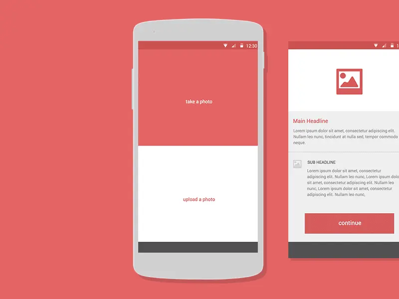 App Wireframe Example from Dribble.
The problems with wireframing apps?
Wireframing has natural limits and we’ve experienced the following snags with the process:
Clarity.
Wireframes are a simplified abstraction that demands attention to understand. In a sea of black and white boxes, little details that can be pivotal parts of the user experience are often overlooked. We’ve found that things we feel are obvious from wireframes have not come across clearly to a client until they are expressed in higher fidelity designs or build.
Final design confusion.
This can pop-up when user testing with wireframes, those not familiar with the process of design and wireframing are apt to say ‘why is the app/website a bunch of grey boxes? It looks so ugly’. No matter how many times you preface the tests the usual ‘this is not the final design’ spiel.
The software time trap.
Working in the same medium as the high-fidelity designs, you face the temptation to jump ahead and focus on aesthetic problems that should come into play later down the line, once the core concept has been nailed.

Improving the wireframing process.
During two recent periods of free-ish time, we looked at ways to remove some of these snags from the wireframing process.
The first was a bit of pretty unglamorous thinking around the boxes that wireframes should tick:
They should express core user journey so that the thinking around this is clear to all stakeholders.
They need to be lo-fi enough to represent early-stage ideas and invite feedback in the initial stages of the project.
They need to be quick to produce and iterate on.
The second was designing some cool stuff to help us do wireframe quickly, easily, but most importantly; clearly.
)
Tools for wireframing apps.
We decided to go back to analogue (the medium is the message; if the wireframe looks closer to a napkin sketch than a final screen design, it’s ultra clear that it’s not the final design).
Additionally, the tactile manual processes of drawing and writing are more cognitively engaging and immersive. But also tend to stimulate more creative thinking when it comes to the products.
There’s a tonne of beautiful free wireframe UI kits out there for Sketch, but none have made it into our design process as they tend to railroad our thinking and stray into visual design territory.
Manual processes also feel more engaging and immersive and tend to stimulate more creative thinking.
Using paper forces the brain to slow down, consider the big picture and helps writers and artists explore abstract ideas using simple shapes or phrases to solidify concepts. Lifehacker, The Benefits of Writing by Hand Versus Typing.
The quick and dirty wireframe kit.
A laser-cut stencil with key UI elements. Portable, easy to iterate and quick to reproduce.
We used it for a while, it produced wireframes that were clearer than basic sketches, could be uniformly interpreted by clients and developers and was relatively quick to use.
The drawbacks with it were the fiddly nature of using a stencil, especially for the smaller elements of the screen at a sensible size for notebooks and A4 paper.
)
Future Iteration:
Clear plastic would be better as a material to help the user see where they are applying elements more easily.
The Stampy UI Kit.
Using rubber stamps with UI elements to build up wireframes quickly.
This kit was a fun analogue process that helped us create really tactile wireframes with a very deliberately old-school aesthetic. Weʼve started user testing ourselves and found the major drawback is the messiness of the ink.
You really have to commit to a session of analogue wireframing, as getting inky hands makes a fluid process of wireframing/computer design difficult (unless you want an inky MacBook).
)
The artefact itself (with all elements included) was also quite chunky and with our love for modern hot-desking, it isnʼt always right in front of you, which means it tends to get forgotten.
Integrating a new technique into your process needs to be immediately achievable.
Future Iteration: make more portable, try to address the inky hands issue.
Published on 9 February 2018, last updated on 10 April 2019